Kpoint Mobile 
UX Engineer
Responsible for scaling the Kpoint web app on multiple mobile form factors for Android. Worked on redesign and development of all media interfaces for the Kpoint Android app.
Kpoint needed a boost on their video viewership on the mobile form factors
kPoint videos are rich multimedia mashups of slides, application sharing, annotations, video, audio, zooming and offline streaming used to satisfy needs of enterprise training programs. The product was desktop / web based and hence could be used only in a suitable environment.
Kpoint wanted to create a mobile platform that could expose core functionalities of their web based Kpoint studio. The aim was to increase video comsumption by making it accessible through a mobile platform.
Why was the viewership so low ?
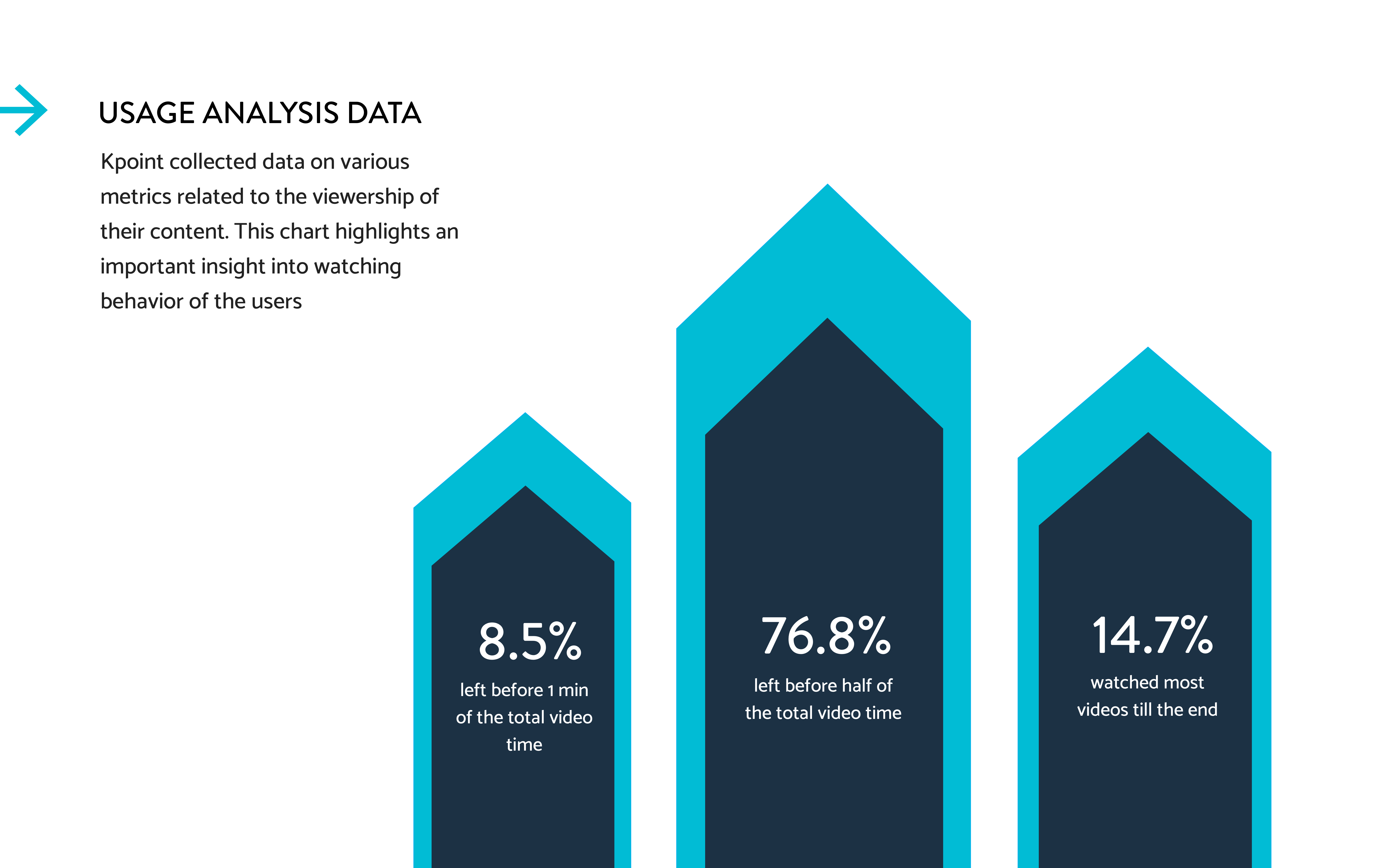
Viewership could be affected by various factors. To understand these, the plan was three fold. Firstly, try to understand how existing mobile platforms take a stab at viewership . It also included making sense of usage analytics to digg into why the content rate was dropping. Lastly, to put users into usability testing routines while marking points of confusion and frustration.
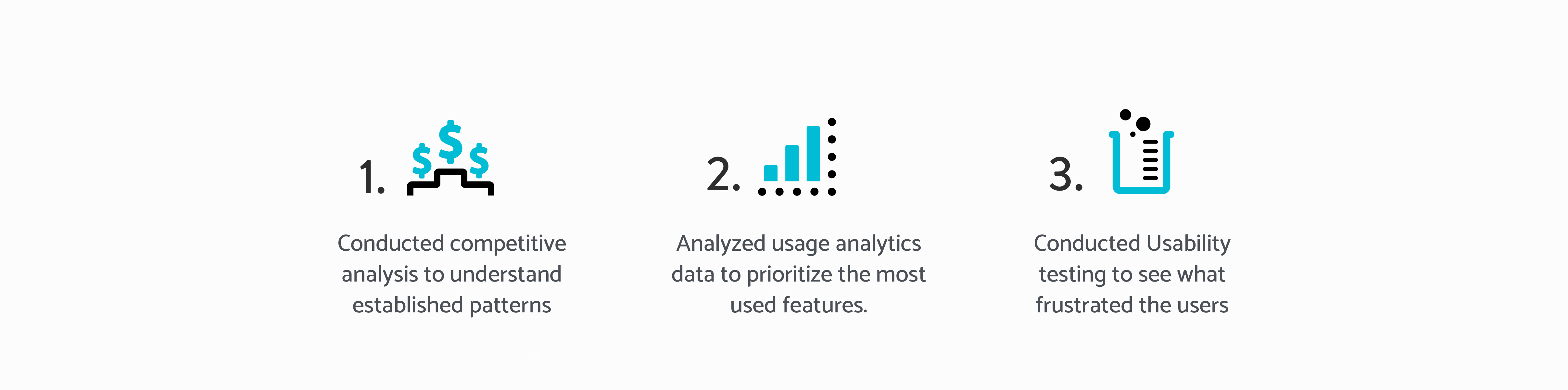
The overall process included competetive analysis of online platform like YouTube, Vimeo, Kaltura, Videogram, CourseEra & EDx.
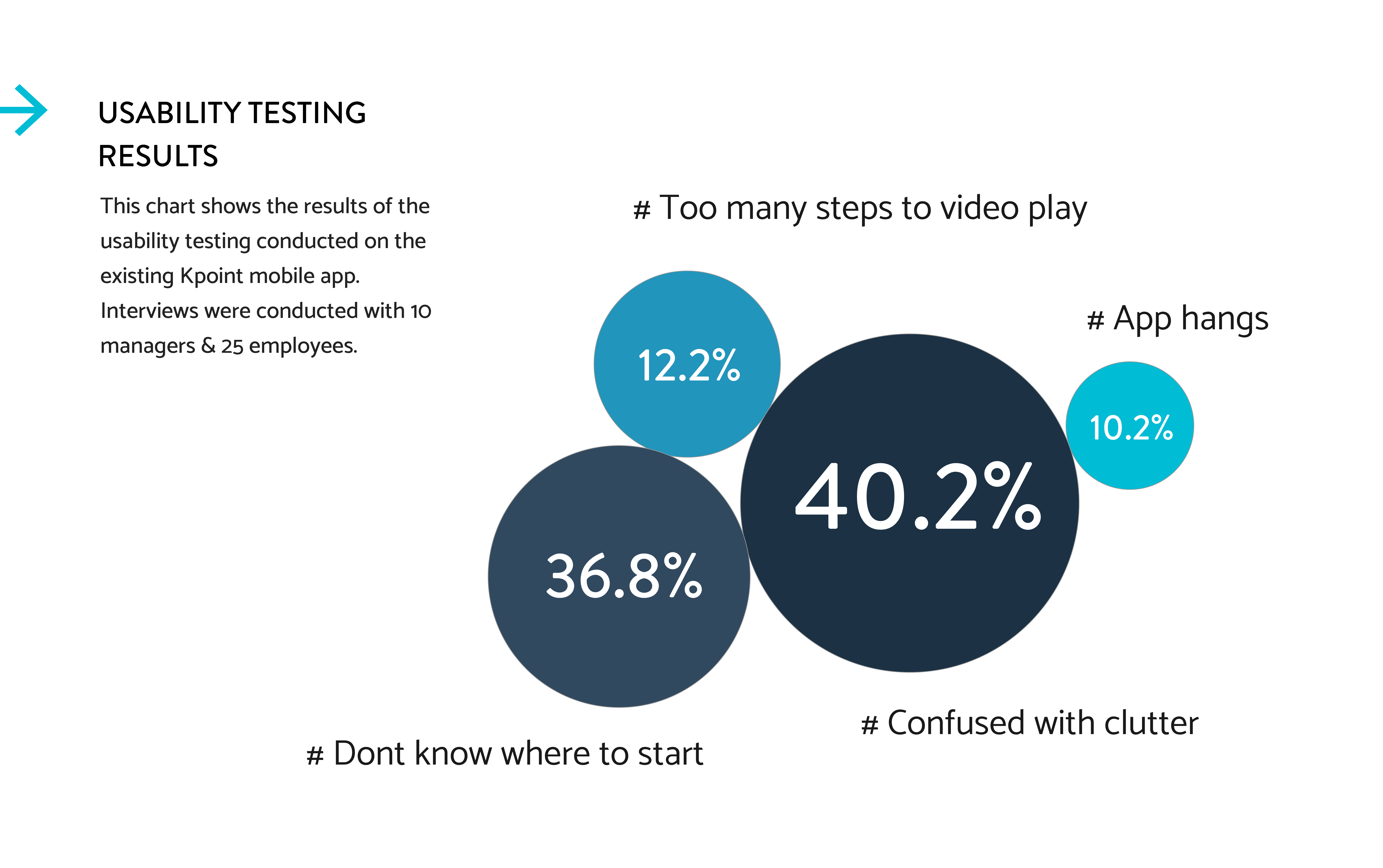
Conducted user testing to come up with what problems the users were facing while using the app. It also included making sense of analytics that were captured to dig into why the content rate was dropping. I conducted usability tests on in-house stakeholders and then went on site to do testing and user interviews of the actual consumers of the application.
Research insights
Users wanted the mobile experience to be consumption driven and distraction free.
How can we make the experience free of all the distractions?
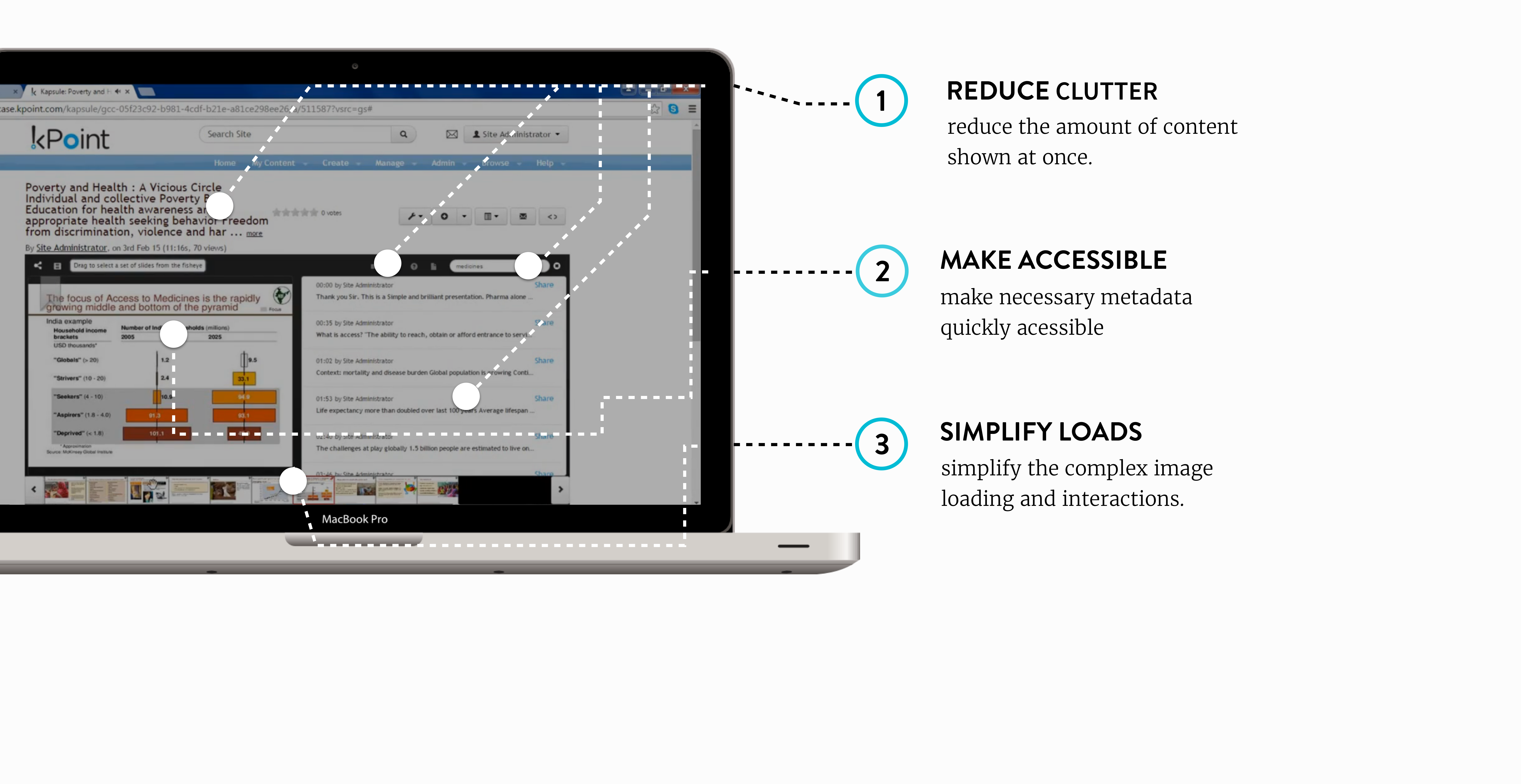
The comparison of data analytics and usability testing yielded that we focus on two main user goals. Make consumption of video easier by reducing clutter, work on Maximum View & Minimum intervention and make the interaction easier by reducing number of steps.
Start on the whiteboard
In this phase, I basically came up with various different ways to go about solving the needs mentioned above. This consisted of one hour of brainstorming sessions spanned over one week.
Creating mockups for iterative testing
The comparison of data analytics and usability testing yielded that we focus on two main user goals. Make consumption of video easier by reducing clutter, work on Maximum View & Minimum intervention and make the interaction easier by reducing number of steps.
Analysing test results
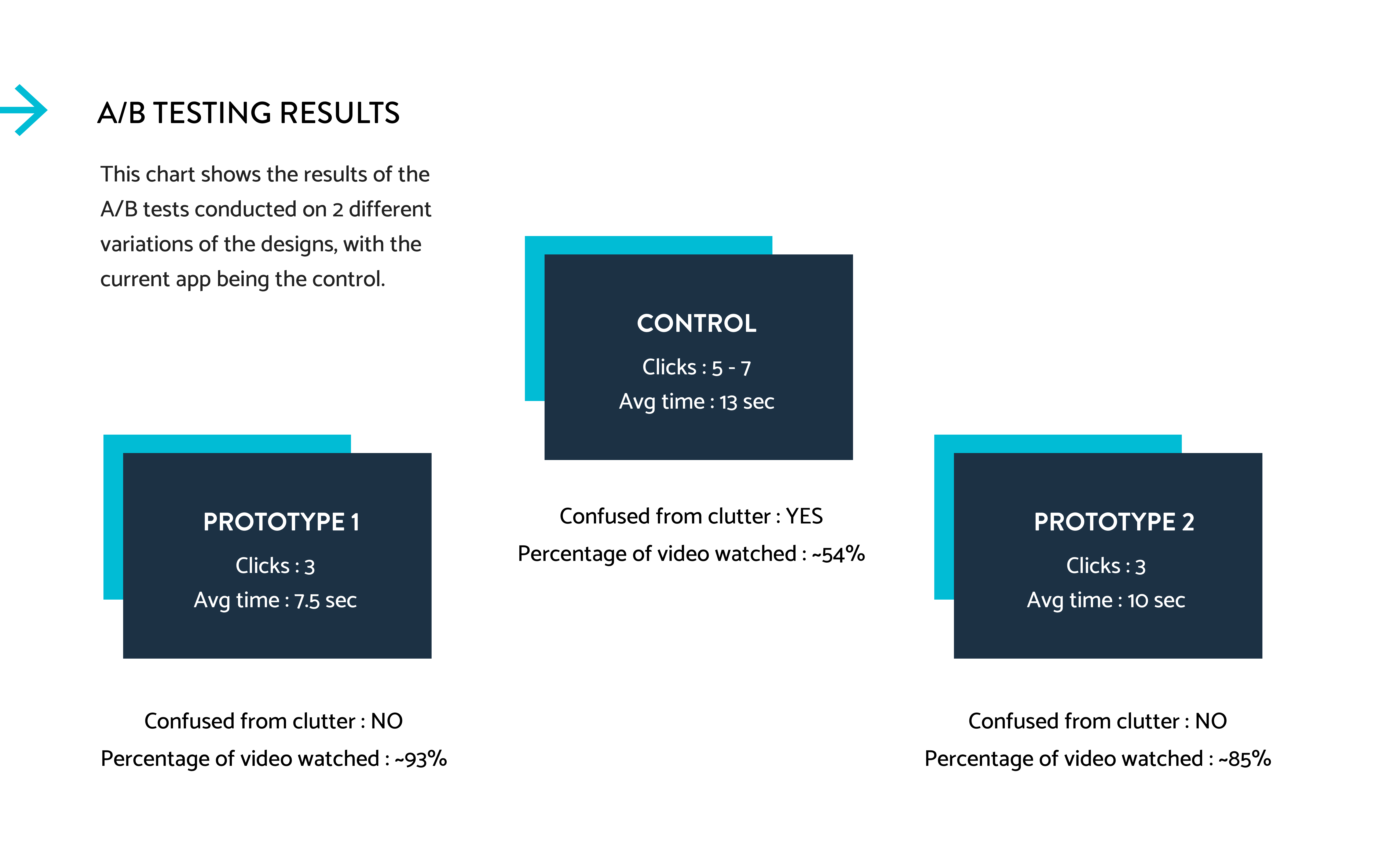
In this phase, me and a team of 2 more people conducted user testing with three variations of prototypes involving the company stakeholders. We then did A/B tests on a small portion of the client customers. Working on the results,we iterated to create one consolidated prototype including user feedback from all three.
Final solution